")

How to Choose the Right Paint Color for Your Space: A Designer’s Guide
Choosing the right paint color seems simple—until you’re staring at a wall of swatches wondering how beige can have 500 shades. The truth is, color is one of the most powerful tools in interior design. It can transform mood, define a space, and tie a home together. Here’s how to approach it like a designer.
1. Start with the Space, Not the Paint Chip
Before falling in love with a color, take a step back and assess the room:
What is the purpose of the space? A bedroom may call for calming hues, while a dining room can handle bolder tones.
What natural light does the room receive? South-facing rooms can handle cooler tones, while north-facing rooms might benefit from warm undertones.
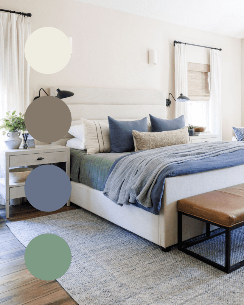
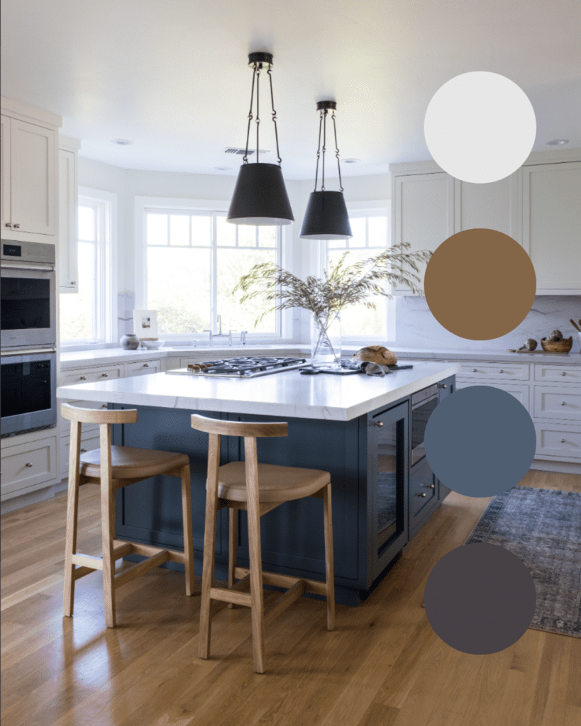
What’s staying in the space? Flooring, furniture, and fixed finishes like countertops should guide your palette, not compete with it.
2. Understand Undertones
Not all whites are created equal—and the same goes for grays, beiges, and blues. Every paint color has an undertone that can shift dramatically depending on lighting and surrounding elements. For example:
A “neutral” gray might read blue in cool lighting or purple next to warm wood tones.
That soft cream might turn yellow if paired with cooler accents.
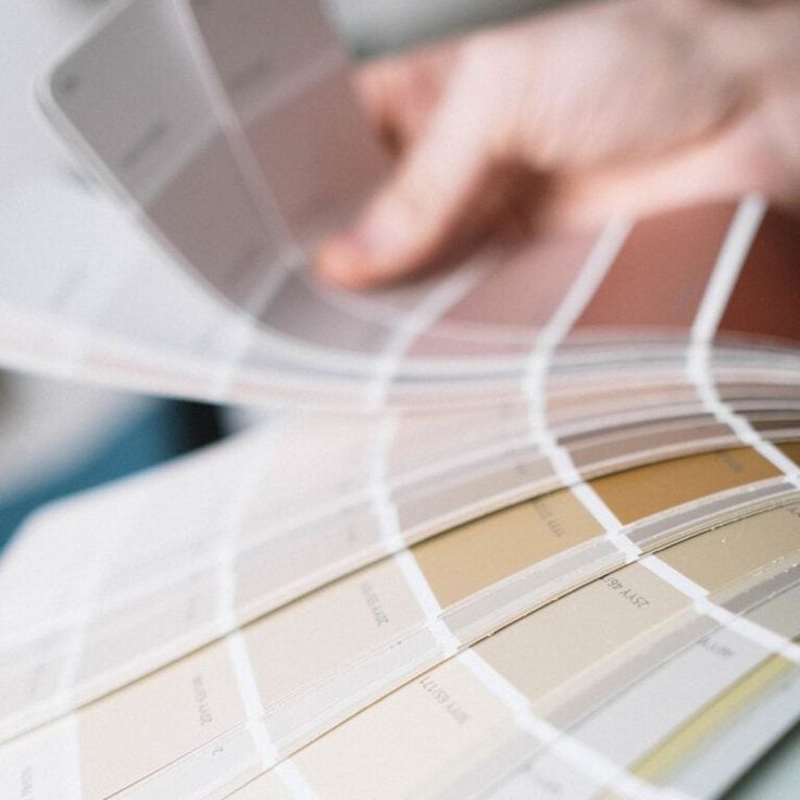
Designer Tip: Always sample paint in your actual space. Apply swatches to multiple walls and observe them in morning, afternoon, and evening light.
3. Consider the Mood
Color influences how a room feels:
∙ Cool tones (blues, greens, soft grays) create a calm, fresh, airy atmosphere.
∙ Warm tones (earthy reds, golds, terra cottas) bring warmth and coziness.
∙ Dark hues add drama and sophistication—but may make a space feel smaller.
∙ Light neutrals open up a space and create a versatile, timeless backdrop.
Think about how you want the space to feel, not just how you want it to look.
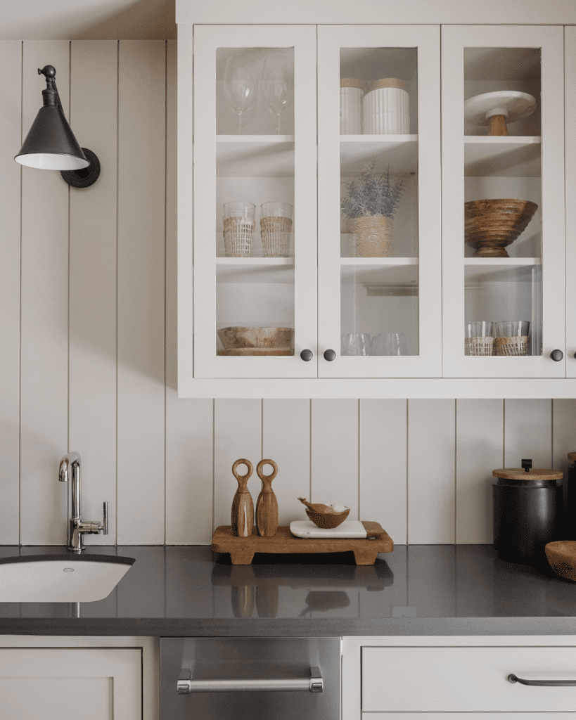
4. Don’t Ignore the Finish
Paint finish plays a role in both appearance and durability:
∙ Matte or flat hides imperfections but is less durable—great for ceilings or low-traffic areas.
∙ Eggshell or satin has a soft sheen and is easier to clean—ideal for living rooms, hallways, and bedrooms.
∙ Semi-gloss or gloss is highly durable and reflective—best for kitchens, bathrooms, trim, and doors.
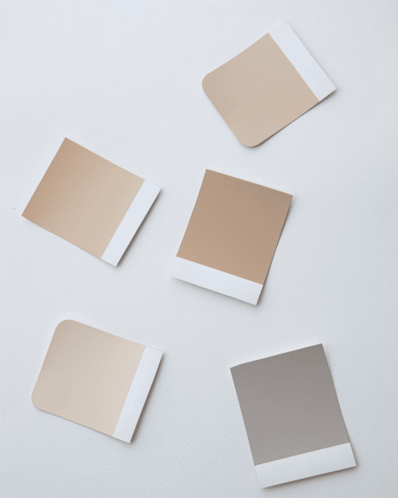
5. Test Before You Commit
Once you’ve narrowed it down, buy sample sizes. Paint large swatches directly on your wall—or on poster board you can move around. Live with them for a few days and trust your instincts. A color that sings in one home might fall flat in another.
6. Think Beyond Walls
Color doesn’t stop at the wall. Ceilings, trim, doors, and cabinetry are opportunities to elevate your space with thoughtful contrast or continuity. A painted ceiling can add depth, and contrasting trim can frame a room beautifully.
Final Thoughts
Choosing the right paint color is about more than just aesthetics—it’s about enhancing how your home makes you feel. If you’re unsure where to start, let your surroundings guide you. Pull colors from a favorite rug, piece of art, or even nature. And remember: paint is one of the easiest things to change, so don’t be afraid to take a creative leap.
Need help pulling it all together?
As an interior design studio, we help clients navigate the endless color possibilities with confidence. Reach out for a color consultation—we’d love to help you create a space that truly feels like home.
")
")
